
Source Code HTML / SASS
Vous trouverez ici les démos et le code source statiques du composant.
On expose les différentes déclinaisons du composant au format HTML et SASS.
Le composant React a été conçu sur la base de cette structure en y ajoutant les interactions que vous trouverez dans notre storybook.
Classic Tabs
<div class="af-tabs">
    <ul class="af-tabs__control">
        <li class="af-tabs__item af-tabs__item--active">
            <button class="af-tabs__link">My first title</button>
        </li>
        <li class="af-tabs__item">
            <button class="af-tabs__link">My second title</button>
        </li>
    </ul>
    <div class="af-tabs__content">
        <div class="af-tabs__pane">Content of my first tab</div>
    </div>
</div>@import '@axa-fr/react-toolkit-core/src/common/scss/core.scss';
.af-tabs {
&__title {
font-family: $font-family-serif;
font-size: 2.25rem;
font-weight: bold;
text-align: left;
color: $white;
}
&__control {
display: flex;
padding-left: 0;
margin-bottom: 0;
list-style: none;
}
&__item {
margin-left: 0;
background-color: $color-tabs-item;
height: 2.5rem;
margin-top: 0.4375rem;
vertical-align: bottom;
border: 1px solid;
border-bottom: 0;
border-color: transparent;
box-sizing: border-box;
cursor: pointer;
position: relative;
margin-right: 0.375rem;
border-radius: 4px 4px 0 0;
&:hover {
background-color: $color-azur;
border-color: $color-azur;
.af-tabs__link {
color: $color-white;
border: none;
}
}
&:last-child {
margin-right: 0;
}
&--active {
background-color: $color-azur;
border-color: $color-azur;
height: 46px;
margin-top: 1px;
.af-tabs__link {
color: $white;
}
}
&--disabled {
background-color: $color-tabs-disabled;
cursor: not-allowed;
&:hover {
background-color: $color-tabs-disabled;
border-color: transparent;
button {
color: $color-tabs-disabled-button;
}
}
button {
pointer-events: none;
cursor: not-allowed;
color: $color-tabs-disabled-button;
}
}
&--has-icon-left {
padding-left: 1rem;
.glyphicon {
left: 1.5rem;
}
}
&--has-icon-right {
padding-right: 1rem;
.glyphicon {
right: 1.5rem;
}
}
.glyphicon {
position: absolute;
top: 50%;
transform: translate(0, -50%);
width: 17px;
}
.af-badge {
z-index: 1;
position: absolute;
right: -14px;
top: -14px;
}
}
&__link {
color: $color-tabs-link;
line-height: 2.688rem;
padding: 0 2.875rem;
font-weight: lighter;
background: none;
border: none;
height: 100%;
overflow: hidden;
display: block;
&:focus {
outline: 0;
}
}
&__content {
border: solid 1px $color-tabs-content;
border-top: 2px solid $color-azur;
background-color: $white;
box-shadow: 0 2px 4px 0 rgba(0, 0, 0, 0.11);
}
&__pane {
padding: 1.25rem;
}
}Complex Tabs
<div class="af-tabs">
    <ul class="af-tabs__control">
        <li class="af-tabs__item af-tabs__item--has-icon-left af-tabs__item--active">
            <button class="af-tabs__link"><span>
                    <svg class="glyphicon glyphicon-ok" xmlns="http://www.w3.org/2000/svg" viewBox="0 0 105 100">
                        <path d="M0.854 57.792l34.917 35 68.167-68.333-17.667-17.667-50.583 50.583-17.167-17.25z"></path>
                    </svg> Title with left icon</span></button>
        </li>
        <li class="af-tabs__item af-tabs__item--has-icon-right">
            <button class="af-tabs__link"><span>Title with right icon
                    <svg class="glyphicon glyphicon-facetime-video" xmlns="http://www.w3.org/2000/svg" viewBox="0 0 100 100">
                        <path d="M0 77.396v-54.167q0-2.583 1.833-4.417t4.417-1.833h62.5q2.583 0 4.417 1.833t1.833 4.417v54.167q0 2.583-1.833 4.417t-4.417 1.833h-62.5q-2.583 0-4.417-1.833t-1.833-4.417zM75 50.313l25-25v50z"></path>
                    </svg></span></button>
        </li>
        <li class="af-tabs__item">
            <button class="af-tabs__link"><span>Title with badge<span class="af-badge af-badge--danger"> 42</span></span></button>
        </li>
        <li class="af-tabs__item af-tabs__item--has-icon-left">
            <button class="af-tabs__link"><span>Title with badge and left icon<span class="af-badge af-badge--error"> Lorem ipsum</span>
                    <svg class="glyphicon glyphicon-facetime-video" xmlns="http://www.w3.org/2000/svg" viewBox="0 0 100 100">
                        <path d="M0 77.396v-54.167q0-2.583 1.833-4.417t4.417-1.833h62.5q2.583 0 4.417 1.833t1.833 4.417v54.167q0 2.583-1.833 4.417t-4.417 1.833h-62.5q-2.583 0-4.417-1.833t-1.833-4.417zM75 50.313l25-25v50z"></path>
                    </svg></span></button>
        </li>
    </ul>
    <div class="af-tabs__content">
        <div class="af-tabs__pane">Content of my first tab</div>
    </div>
</div>@import '@axa-fr/react-toolkit-core/src/common/scss/core.scss';
.af-tabs {
&__title {
font-family: $font-family-serif;
font-size: 2.25rem;
font-weight: bold;
text-align: left;
color: $white;
}
&__control {
display: flex;
padding-left: 0;
margin-bottom: 0;
list-style: none;
}
&__item {
margin-left: 0;
background-color: $color-tabs-item;
height: 2.5rem;
margin-top: 0.4375rem;
vertical-align: bottom;
border: 1px solid;
border-bottom: 0;
border-color: transparent;
box-sizing: border-box;
cursor: pointer;
position: relative;
margin-right: 0.375rem;
border-radius: 4px 4px 0 0;
&:hover {
background-color: $color-azur;
border-color: $color-azur;
.af-tabs__link {
color: $color-white;
border: none;
}
}
&:last-child {
margin-right: 0;
}
&--active {
background-color: $color-azur;
border-color: $color-azur;
height: 46px;
margin-top: 1px;
.af-tabs__link {
color: $white;
}
}
&--disabled {
background-color: $color-tabs-disabled;
cursor: not-allowed;
&:hover {
background-color: $color-tabs-disabled;
border-color: transparent;
button {
color: $color-tabs-disabled-button;
}
}
button {
pointer-events: none;
cursor: not-allowed;
color: $color-tabs-disabled-button;
}
}
&--has-icon-left {
padding-left: 1rem;
.glyphicon {
left: 1.5rem;
}
}
&--has-icon-right {
padding-right: 1rem;
.glyphicon {
right: 1.5rem;
}
}
.glyphicon {
position: absolute;
top: 50%;
transform: translate(0, -50%);
width: 17px;
}
.af-badge {
z-index: 1;
position: absolute;
right: -14px;
top: -14px;
}
}
&__link {
color: $color-tabs-link;
line-height: 2.688rem;
padding: 0 2.875rem;
font-weight: lighter;
background: none;
border: none;
height: 100%;
overflow: hidden;
display: block;
&:focus {
outline: 0;
}
}
&__content {
border: solid 1px $color-tabs-content;
border-top: 2px solid $color-azur;
background-color: $white;
box-shadow: 0 2px 4px 0 rgba(0, 0, 0, 0.11);
}
&__pane {
padding: 1.25rem;
}
}Tabs with long text
<div class="af-tabs">
    <ul class="af-tabs__control">
        <li class="af-tabs__item af-tabs__item--active af-tabs__item--has-icon-left">
            <button class="af-tabs__link"><span>
                    <svg class="glyphicon glyphicon-ok" xmlns="http://www.w3.org/2000/svg" viewBox="0 0 105 100">
                        <path d="M0.854 57.792l34.917 35 68.167-68.333-17.667-17.667-50.583 50.583-17.167-17.25z"></path>
                    </svg> Title with left icon</span></button>
        </li>
        <li class="af-tabs__item af-tabs__item--has-icon-right">
            <button class="af-tabs__link"><span>Title with right icon
                    <svg class="glyphicon glyphicon-facetime-video" xmlns="http://www.w3.org/2000/svg" viewBox="0 0 100 100">
                        <path d="M0 77.396v-54.167q0-2.583 1.833-4.417t4.417-1.833h62.5q2.583 0 4.417 1.833t1.833 4.417v54.167q0 2.583-1.833 4.417t-4.417 1.833h-62.5q-2.583 0-4.417-1.833t-1.833-4.417zM75 50.313l25-25v50z"></path>
                    </svg></span></button>
        </li>
        <li class="af-tabs__item">
            <button class="af-tabs__link"><span>Title with badge<span class="af-badge af-badge--danger"> 42</span></span></button>
        </li>
        <li class="af-tabs__item">
            <button class="af-tabs__link">I try to write a very long title without any sense just to see what is the behavior of my title component in this case</button>
        </li>
    </ul>
    <div class="af-tabs__content">
        <div class="af-tabs__pane">Content of my first tab</div>
    </div>
</div>@import '@axa-fr/react-toolkit-core/src/common/scss/core.scss';
.af-tabs {
&__title {
font-family: $font-family-serif;
font-size: 2.25rem;
font-weight: bold;
text-align: left;
color: $white;
}
&__control {
display: flex;
padding-left: 0;
margin-bottom: 0;
list-style: none;
}
&__item {
margin-left: 0;
background-color: $color-tabs-item;
height: 2.5rem;
margin-top: 0.4375rem;
vertical-align: bottom;
border: 1px solid;
border-bottom: 0;
border-color: transparent;
box-sizing: border-box;
cursor: pointer;
position: relative;
margin-right: 0.375rem;
border-radius: 4px 4px 0 0;
&:hover {
background-color: $color-azur;
border-color: $color-azur;
.af-tabs__link {
color: $color-white;
border: none;
}
}
&:last-child {
margin-right: 0;
}
&--active {
background-color: $color-azur;
border-color: $color-azur;
height: 46px;
margin-top: 1px;
.af-tabs__link {
color: $white;
}
}
&--disabled {
background-color: $color-tabs-disabled;
cursor: not-allowed;
&:hover {
background-color: $color-tabs-disabled;
border-color: transparent;
button {
color: $color-tabs-disabled-button;
}
}
button {
pointer-events: none;
cursor: not-allowed;
color: $color-tabs-disabled-button;
}
}
&--has-icon-left {
padding-left: 1rem;
.glyphicon {
left: 1.5rem;
}
}
&--has-icon-right {
padding-right: 1rem;
.glyphicon {
right: 1.5rem;
}
}
.glyphicon {
position: absolute;
top: 50%;
transform: translate(0, -50%);
width: 17px;
}
.af-badge {
z-index: 1;
position: absolute;
right: -14px;
top: -14px;
}
}
&__link {
color: $color-tabs-link;
line-height: 2.688rem;
padding: 0 2.875rem;
font-weight: lighter;
background: none;
border: none;
height: 100%;
overflow: hidden;
display: block;
&:focus {
outline: 0;
}
}
&__content {
border: solid 1px $color-tabs-content;
border-top: 2px solid $color-azur;
background-color: $white;
box-shadow: 0 2px 4px 0 rgba(0, 0, 0, 0.11);
}
&__pane {
padding: 1.25rem;
}
}React interactions
Vous trouverez ici les démos Storybook pour visualiser les interactions du composant.
Vous avez la possibilité de jouer avec les propriétés du composant React sur notre storybook.
Generales Guidelines
Les guidelines permettent de décrire l'ensemble des règles et des éléments graaphiques pour la conception des interfaces.
Elle sont destinées à être respectées par tous les intervenants d'un projet (UX, Développeurs, PO, etc ...), il s'agit donc d'un référentiel commun.
1) Définition
Les onglets permettent d’afficher plusieurs « sections » de contenu sur un même espace.
2) Use case
- Les onglets doivent être utilisés pour des sections de contenus connexes, il doit y avoir un lien entre elles.
- Le premier onglet doit être ouverte par défaut, ce doit être la section la plus pertinente en termes de contenu. L’ordre des onglets doit rester cohérent dans l’ensemble du produit.
3) DO/DONT
- Ne pas utiliser des onglets sur plus d’une ligne.
- Pas plus de sept onglets pour un bloc de contenu.
- Ne pas utiliser d’onglets pour un tutoriel étape par étape, on leur préfèrera une barre de progression.
- Ne pas utiliser d’onglets dans les cartes et fenêtres modales.
5) Utilisation
a) Position
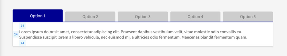
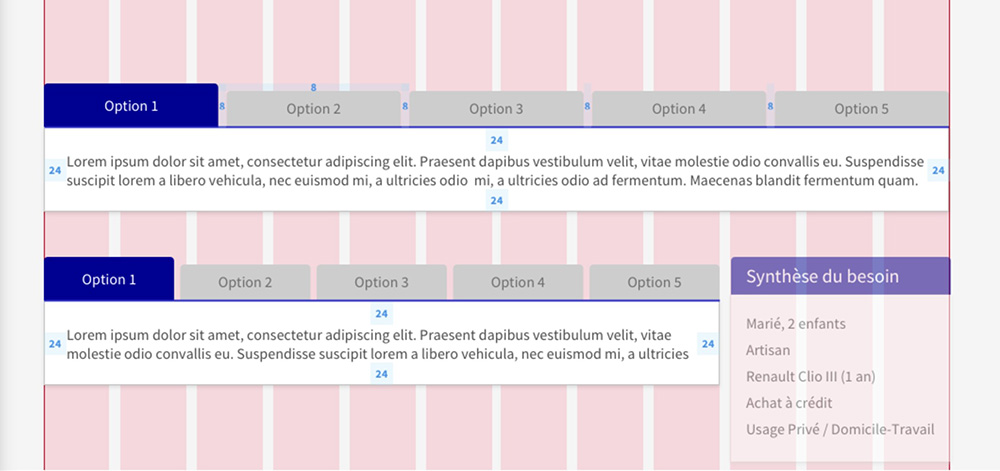
Le bloc onglet devra prendre toute la largeur disponible, sans autre composant de part et d’autre.
b) Alignement
Les onglets sont alignés à gauche sur une même ligne.
c) Contenu
- Le « bouton » de l’onglet contiendra uniquement un label.
- Le bloc de contenu pourra quant à lui contenir n’importe quel contenu appartenant au design system.
d) Rédaction
Le label des onglets doit être limité à 2-3 mots maximum.
e) Pictogrammes
Aucun pictogramme ne doit être utilisé dans le « bouton ».
f) Action
L’utilisateur peut changer d’onglet en cliquant sur l’onglet qu’il souhaite ouvrir. Le précédent onglet ouvert repasse automatiquement en inactif.
g) États
- Actif
- Inactif
Style
Un style a été défini pour chaque composant, il possible d'importer uniquement le style du composant sur le projet fin optimiser le bundle.
On liste également les codes couleur utilisés, cliquez-ici pour voir l'ensemble des couleurs du Design System
Imports SASS
@import '@axa-fr/react-toolkit-core/src/common/scss/core.scss';
@import '@axa-fr/react-toolkit-tabs/dist/tabs.scss';
Typography
Component text should be set in sentence case, with only the first word in a phrase and any proper nouns capitalized.
| Class | Font-size (px/rem) | Font-weight | Font-family |
|---|---|---|---|
| .af-tabs | 16 / 1 | 400 | Source Sans Pro Regular |