
Source Code HTML / SASS
Vous trouverez ici les démos et le code source statiques du composant.
On expose les différentes déclinaisons du composant au format HTML et SASS.
Le composant React a été conçu sur la base de cette structure en y ajoutant les interactions que vous trouverez dans notre storybook.
Classic Input Checkbox
<div class="row af-form__group af-form__group--label-top">
    <div class="col-md-2">
        <label class="af-form__group-label">Classic checkbox</label>
    </div>
    <div class="col-md-10">
        <div class="af-form__checkbox">
            <input class="af-form__input-checkbox" name="classic" type="checkbox" id="checkbox1" />
            <label class="af-form__label" for="checkbox1"><span class="af-form__indicator">
                    <svg class="glyphicon glyphicon-ok" xmlns="http://www.w3.org/2000/svg" viewBox="0 0 105 100">
                        <path d="M0.854 57.792l34.917 35 68.167-68.333-17.667-17.667-50.583 50.583-17.167-17.25z"></path>
                    </svg></span><span class="af-form__description">lorem ipsum dolor sit amet</span></label>
        </div>
        <div class="af-form__checkbox">
            <input class="af-form__input-checkbox" name="classic" type="checkbox" id="checkbox2" />
            <label class="af-form__label" for="checkbox2"><span class="af-form__indicator">
                    <svg class="glyphicon glyphicon-ok" xmlns="http://www.w3.org/2000/svg" viewBox="0 0 105 100">
                        <path d="M0.854 57.792l34.917 35 68.167-68.333-17.667-17.667-50.583 50.583-17.167-17.25z"></path>
                    </svg></span><span class="af-form__description">Nam sem nisi, auctor sit amet massa sit amet</span></label>
        </div>
        <div class="af-form__checkbox">
            <input class="af-form__input-checkbox" name="classic" type="checkbox" id="checkbox3" />
            <label class="af-form__label" for="checkbox3"><span class="af-form__indicator">
                    <svg class="glyphicon glyphicon-ok" xmlns="http://www.w3.org/2000/svg" viewBox="0 0 105 100">
                        <path d="M0.854 57.792l34.917 35 68.167-68.333-17.667-17.667-50.583 50.583-17.167-17.25z"></path>
                    </svg></span><span class="af-form__description">Ut sollicitudin eleifend tincidunt</span></label>
        </div>
        <div class="af-form__checkbox  af-form__checkbox--disabled">
            <input class="af-form__input-checkbox" name="classic" type="checkbox" id="checkbox4" disabled="disabled" />
            <label class="af-form__label" for="checkbox4"><span class="af-form__indicator">
                    <svg class="glyphicon glyphicon-ok" xmlns="http://www.w3.org/2000/svg" viewBox="0 0 105 100">
                        <path d="M0.854 57.792l34.917 35 68.167-68.333-17.667-17.667-50.583 50.583-17.167-17.25z"></path>
                    </svg></span><span class="af-form__description">disabled</span></label>
        </div>
    </div>
</div>@import '@axa-fr/react-toolkit-core/src/common/scss/core.scss';
.af-form {
&__checkbox,
&__checkbox-inline {
&--disabled {
.af-form__label {
opacity: 0.4;
cursor: not-allowed;
}
}
&--error {
.af-form__label {
color: $color-red-axa;
}
.af-form__indicator {
border-color: $color-red-axa;
}
}
&--warning {
.af-form__label {
color: $color-orange-dark;
}
.af-form__indicator {
border-color: $color-orange-dark;
}
}
}
&__input-checkbox {
position: absolute;
z-index: -1;
visibility: hidden;
&:checked+.af-form__label {
.af-form__indicator {
background-color: $color-azur;
border-color: $color-azur;
color: $white;
.glyphicon-ok {
display: block;
}
}
}
&:focus+.af-form__label {
color: $color-azur;
}
}
/* Déclinaisons des checkbox ****************************************************/
/* Classic */
&__checkbox {
display: block;
align-items: center;
position: relative;
border-bottom: 1px solid $color-silver;
&:nth-last-child(1) {
border-bottom: 0;
}
}
/* Inline */
&__checkbox-inline {
display: inline-flex;
align-items: center;
margin-right: 1rem;
position: relative;
.af-form__label {
padding: 0;
}
}
/* Custom */
&__checkbox-custom,
&__checkbox-toggle {
display: inline-flex;
align-items: center;
margin: 0 0.3rem 0.3rem 0;
text-align: center;
position: relative;
.af-form__label {
padding: 0.6rem 2rem;
background: $color-mercury;
border: $color-gray;
font-weight: normal;
cursor: pointer;
box-shadow: inset 0 -2px 0 0 $color-scorpion;
margin: 0;
}
.af-form__indicator {
left: 1rem;
}
.af-form__description {
padding-left: 0.5em;
}
.af-form__input-checkbox {
position: absolute;
z-index: -1;
visibility: hidden;
&:checked+.af-form__label {
background-color: $color-azur;
box-shadow: inset 0 -2px 0 0 $color-axa;
color: $white;
.af-form__indicator {
background: $white;
border: 1px solid $color-silver;
color: $color-mine-shaft;
.glyphicon-ok {
color: $color-azur;
}
}
}
&:focus+.af-form__label {
background-color: $color-axa;
color: $white;
box-shadow: 0 0 5px $color-axa;
}
}
&--disabled {
.af-form__label {
cursor: not-allowed;
opacity: 0.6;
box-shadow: inset 0 -2px 0 0 $color-silver;
}
.af-form__description {
opacity: 0.4;
}
}
&--error {
.af-form__label {
background: $error-custom-bg;
border: 1px solid $error-custom-border;
color: $color-red-axa;
box-shadow: inset 0 -2px 0 0 $color-red-axa;
}
.af-form__indicator {
border-color: $color-red-axa;
}
}
&:hover {
.af-form__label {
background-color: $color-azur;
border-color: $color-axa;
color: $white;
box-shadow: inset 0 -2px 0 0 $color-axa;
}
}
}
/* Toggle */
&__checkbox-toggle {
.af-form__label {
padding: 1rem 1.6rem;
border: none;
box-shadow: none;
border-radius: 50px;
}
.af-form__indicator {
left: 5px;
top: 50%;
position: absolute;
transform: translate(0, -50%);
border: 0;
padding: 0.7rem;
border-radius: 100%;
transition: 0.4s;
}
.af-form__description {
display: none;
}
.af-form__input-checkbox {
&:checked+.af-form__label {
background-color: $color-green-4;
color: $white;
border: none;
box-shadow: none;
.af-form__indicator {
background: $white;
color: $color-mine-shaft;
transform: translate(17px, -50%);
.glyphicon-ok {
color: $color-azur;
display: none;
}
}
}
&:focus+.af-form__label {
background-color: $color-axa;
color: $white;
border: none;
box-shadow: none;
}
}
&:hover {
.af-form__label {
border: none;
box-shadow: none;
}
}
&--error {
.af-form__label {
background-color: $color-red-error;
}
}
&--warning {
.af-form__label {
background-color: $color-orange-dark;
}
}
&--disabled:hover {
.af-form__label {
background-color: $color-gray-3;
}
}
}
}Input Checkbox Success
<div class="row af-form__group af-form__group--label-top">
    <div class="col-md-2">
        <label class="af-form__group-label">Classic checkbox</label>
    </div>
    <div class="col-md-10">
        <div class="af-form__checkbox  af-form__checkbox--success">
            <input class="af-form__input-checkbox" name="classic" type="checkbox" id="checkbox5" />
            <label class="af-form__label" for="checkbox5"><span class="af-form__indicator">
                    <svg class="glyphicon glyphicon-ok" xmlns="http://www.w3.org/2000/svg" viewBox="0 0 105 100">
                        <path d="M0.854 57.792l34.917 35 68.167-68.333-17.667-17.667-50.583 50.583-17.167-17.25z"></path>
                    </svg></span><span class="af-form__description">lorem ipsum dolor sit amet</span></label>
        </div>
        <div class="af-form__checkbox  af-form__checkbox--success">
            <input class="af-form__input-checkbox" name="classic" type="checkbox" id="checkbox6" />
            <label class="af-form__label" for="checkbox6"><span class="af-form__indicator">
                    <svg class="glyphicon glyphicon-ok" xmlns="http://www.w3.org/2000/svg" viewBox="0 0 105 100">
                        <path d="M0.854 57.792l34.917 35 68.167-68.333-17.667-17.667-50.583 50.583-17.167-17.25z"></path>
                    </svg></span><span class="af-form__description">Nam sem nisi, auctor sit amet massa sit amet</span></label>
        </div>
        <div class="af-form__checkbox  af-form__checkbox--success">
            <input class="af-form__input-checkbox" name="classic" type="checkbox" id="checkbox7" />
            <label class="af-form__label" for="checkbox7"><span class="af-form__indicator">
                    <svg class="glyphicon glyphicon-ok" xmlns="http://www.w3.org/2000/svg" viewBox="0 0 105 100">
                        <path d="M0.854 57.792l34.917 35 68.167-68.333-17.667-17.667-50.583 50.583-17.167-17.25z"></path>
                    </svg></span><span class="af-form__description">Ut sollicitudin eleifend tincidunt</span></label>
        </div>
        <div class="af-form__checkbox  af-form__checkbox--disabled">
            <input class="af-form__input-checkbox" name="classic" type="checkbox" id="checkbox8" disabled="disabled" />
            <label class="af-form__label" for="checkbox8"><span class="af-form__indicator">
                    <svg class="glyphicon glyphicon-ok" xmlns="http://www.w3.org/2000/svg" viewBox="0 0 105 100">
                        <path d="M0.854 57.792l34.917 35 68.167-68.333-17.667-17.667-50.583 50.583-17.167-17.25z"></path>
                    </svg></span><span class="af-form__description">disabled</span></label>
        </div>
    </div>
</div>@import '@axa-fr/react-toolkit-core/src/common/scss/core.scss';
.af-form {
&__checkbox,
&__checkbox-inline {
&--disabled {
.af-form__label {
opacity: 0.4;
cursor: not-allowed;
}
}
&--error {
.af-form__label {
color: $color-red-axa;
}
.af-form__indicator {
border-color: $color-red-axa;
}
}
&--warning {
.af-form__label {
color: $color-orange-dark;
}
.af-form__indicator {
border-color: $color-orange-dark;
}
}
}
&__input-checkbox {
position: absolute;
z-index: -1;
visibility: hidden;
&:checked+.af-form__label {
.af-form__indicator {
background-color: $color-azur;
border-color: $color-azur;
color: $white;
.glyphicon-ok {
display: block;
}
}
}
&:focus+.af-form__label {
color: $color-azur;
}
}
/* Déclinaisons des checkbox ****************************************************/
/* Classic */
&__checkbox {
display: block;
align-items: center;
position: relative;
border-bottom: 1px solid $color-silver;
&:nth-last-child(1) {
border-bottom: 0;
}
}
/* Inline */
&__checkbox-inline {
display: inline-flex;
align-items: center;
margin-right: 1rem;
position: relative;
.af-form__label {
padding: 0;
}
}
/* Custom */
&__checkbox-custom,
&__checkbox-toggle {
display: inline-flex;
align-items: center;
margin: 0 0.3rem 0.3rem 0;
text-align: center;
position: relative;
.af-form__label {
padding: 0.6rem 2rem;
background: $color-mercury;
border: $color-gray;
font-weight: normal;
cursor: pointer;
box-shadow: inset 0 -2px 0 0 $color-scorpion;
margin: 0;
}
.af-form__indicator {
left: 1rem;
}
.af-form__description {
padding-left: 0.5em;
}
.af-form__input-checkbox {
position: absolute;
z-index: -1;
visibility: hidden;
&:checked+.af-form__label {
background-color: $color-azur;
box-shadow: inset 0 -2px 0 0 $color-axa;
color: $white;
.af-form__indicator {
background: $white;
border: 1px solid $color-silver;
color: $color-mine-shaft;
.glyphicon-ok {
color: $color-azur;
}
}
}
&:focus+.af-form__label {
background-color: $color-axa;
color: $white;
box-shadow: 0 0 5px $color-axa;
}
}
&--disabled {
.af-form__label {
cursor: not-allowed;
opacity: 0.6;
box-shadow: inset 0 -2px 0 0 $color-silver;
}
.af-form__description {
opacity: 0.4;
}
}
&--error {
.af-form__label {
background: $error-custom-bg;
border: 1px solid $error-custom-border;
color: $color-red-axa;
box-shadow: inset 0 -2px 0 0 $color-red-axa;
}
.af-form__indicator {
border-color: $color-red-axa;
}
}
&:hover {
.af-form__label {
background-color: $color-azur;
border-color: $color-axa;
color: $white;
box-shadow: inset 0 -2px 0 0 $color-axa;
}
}
}
/* Toggle */
&__checkbox-toggle {
.af-form__label {
padding: 1rem 1.6rem;
border: none;
box-shadow: none;
border-radius: 50px;
}
.af-form__indicator {
left: 5px;
top: 50%;
position: absolute;
transform: translate(0, -50%);
border: 0;
padding: 0.7rem;
border-radius: 100%;
transition: 0.4s;
}
.af-form__description {
display: none;
}
.af-form__input-checkbox {
&:checked+.af-form__label {
background-color: $color-green-4;
color: $white;
border: none;
box-shadow: none;
.af-form__indicator {
background: $white;
color: $color-mine-shaft;
transform: translate(17px, -50%);
.glyphicon-ok {
color: $color-azur;
display: none;
}
}
}
&:focus+.af-form__label {
background-color: $color-axa;
color: $white;
border: none;
box-shadow: none;
}
}
&:hover {
.af-form__label {
border: none;
box-shadow: none;
}
}
&--error {
.af-form__label {
background-color: $color-red-error;
}
}
&--warning {
.af-form__label {
background-color: $color-orange-dark;
}
}
&--disabled:hover {
.af-form__label {
background-color: $color-gray-3;
}
}
}
}Input Checkbox Error
<div class="row af-form__group af-form__group--label-top">
    <div class="col-md-2">
        <label class="af-form__group-label">Classic checkbox</label>
    </div>
    <div class="col-md-10">
        <div class="af-form__checkbox  af-form__checkbox--error">
            <input class="af-form__input-checkbox" name="classic" type="checkbox" id="checkbox9" />
            <label class="af-form__label" for="checkbox9"><span class="af-form__indicator">
                    <svg class="glyphicon glyphicon-ok" xmlns="http://www.w3.org/2000/svg" viewBox="0 0 105 100">
                        <path d="M0.854 57.792l34.917 35 68.167-68.333-17.667-17.667-50.583 50.583-17.167-17.25z"></path>
                    </svg></span><span class="af-form__description">lorem ipsum dolor sit amet</span></label>
        </div>
        <div class="af-form__checkbox  af-form__checkbox--error">
            <input class="af-form__input-checkbox" name="classic" type="checkbox" id="checkbox10" />
            <label class="af-form__label" for="checkbox10"><span class="af-form__indicator">
                    <svg class="glyphicon glyphicon-ok" xmlns="http://www.w3.org/2000/svg" viewBox="0 0 105 100">
                        <path d="M0.854 57.792l34.917 35 68.167-68.333-17.667-17.667-50.583 50.583-17.167-17.25z"></path>
                    </svg></span><span class="af-form__description">Nam sem nisi, auctor sit amet massa sit amet</span></label>
        </div>
        <div class="af-form__checkbox  af-form__checkbox--error">
            <input class="af-form__input-checkbox" name="classic" type="checkbox" id="checkbox11" />
            <label class="af-form__label" for="checkbox11"><span class="af-form__indicator">
                    <svg class="glyphicon glyphicon-ok" xmlns="http://www.w3.org/2000/svg" viewBox="0 0 105 100">
                        <path d="M0.854 57.792l34.917 35 68.167-68.333-17.667-17.667-50.583 50.583-17.167-17.25z"></path>
                    </svg></span><span class="af-form__description">Ut sollicitudin eleifend tincidunt</span></label>
        </div>
        <div class="af-form__checkbox  af-form__checkbox--error">
            <input class="af-form__input-checkbox" name="classic" type="checkbox" id="checkbox12" />
            <label class="af-form__label" for="checkbox12"><span class="af-form__indicator">
                    <svg class="glyphicon glyphicon-ok" xmlns="http://www.w3.org/2000/svg" viewBox="0 0 105 100">
                        <path d="M0.854 57.792l34.917 35 68.167-68.333-17.667-17.667-50.583 50.583-17.167-17.25z"></path>
                    </svg></span><span class="af-form__description">eleifend</span></label>
        </div><small class="af-form__message  af-form__message--error">
            <svg class="glyphicon glyphicon-exclamation-sign" xmlns="http://www.w3.org/2000/svg" viewBox="0 0 100 100">
                <path d="M4.922 48.828q0-9.219 3.555-17.539t9.609-14.375 14.375-9.609 17.539-3.555 17.539 3.555 14.375 9.609 9.609 14.375 3.555 17.539-3.555 17.539-9.609 14.375-14.375 9.609-17.539 3.555-17.539-3.555-14.375-9.609-9.609-14.375-3.555-17.539zM38.75 29.219l4.531 23.594q0.313 1.563 1.68 2.695t2.93 1.133h4.219q1.563 0 2.93-1.133t1.68-2.695l4.531-23.594q0.313-1.563-0.625-2.695t-2.5-1.133h-16.172q-1.641 0-2.578 1.133t-0.625 2.695zM42.188 72.266h15.625v-7.813h-15.625v7.813z"></path>
            </svg><span class="af-form__error-text">Message d'erreur</span></small>
    </div>
</div>@import '@axa-fr/react-toolkit-core/src/common/scss/core.scss';
.af-form {
&__checkbox,
&__checkbox-inline {
&--disabled {
.af-form__label {
opacity: 0.4;
cursor: not-allowed;
}
}
&--error {
.af-form__label {
color: $color-red-axa;
}
.af-form__indicator {
border-color: $color-red-axa;
}
}
&--warning {
.af-form__label {
color: $color-orange-dark;
}
.af-form__indicator {
border-color: $color-orange-dark;
}
}
}
&__input-checkbox {
position: absolute;
z-index: -1;
visibility: hidden;
&:checked+.af-form__label {
.af-form__indicator {
background-color: $color-azur;
border-color: $color-azur;
color: $white;
.glyphicon-ok {
display: block;
}
}
}
&:focus+.af-form__label {
color: $color-azur;
}
}
/* Déclinaisons des checkbox ****************************************************/
/* Classic */
&__checkbox {
display: block;
align-items: center;
position: relative;
border-bottom: 1px solid $color-silver;
&:nth-last-child(1) {
border-bottom: 0;
}
}
/* Inline */
&__checkbox-inline {
display: inline-flex;
align-items: center;
margin-right: 1rem;
position: relative;
.af-form__label {
padding: 0;
}
}
/* Custom */
&__checkbox-custom,
&__checkbox-toggle {
display: inline-flex;
align-items: center;
margin: 0 0.3rem 0.3rem 0;
text-align: center;
position: relative;
.af-form__label {
padding: 0.6rem 2rem;
background: $color-mercury;
border: $color-gray;
font-weight: normal;
cursor: pointer;
box-shadow: inset 0 -2px 0 0 $color-scorpion;
margin: 0;
}
.af-form__indicator {
left: 1rem;
}
.af-form__description {
padding-left: 0.5em;
}
.af-form__input-checkbox {
position: absolute;
z-index: -1;
visibility: hidden;
&:checked+.af-form__label {
background-color: $color-azur;
box-shadow: inset 0 -2px 0 0 $color-axa;
color: $white;
.af-form__indicator {
background: $white;
border: 1px solid $color-silver;
color: $color-mine-shaft;
.glyphicon-ok {
color: $color-azur;
}
}
}
&:focus+.af-form__label {
background-color: $color-axa;
color: $white;
box-shadow: 0 0 5px $color-axa;
}
}
&--disabled {
.af-form__label {
cursor: not-allowed;
opacity: 0.6;
box-shadow: inset 0 -2px 0 0 $color-silver;
}
.af-form__description {
opacity: 0.4;
}
}
&--error {
.af-form__label {
background: $error-custom-bg;
border: 1px solid $error-custom-border;
color: $color-red-axa;
box-shadow: inset 0 -2px 0 0 $color-red-axa;
}
.af-form__indicator {
border-color: $color-red-axa;
}
}
&:hover {
.af-form__label {
background-color: $color-azur;
border-color: $color-axa;
color: $white;
box-shadow: inset 0 -2px 0 0 $color-axa;
}
}
}
/* Toggle */
&__checkbox-toggle {
.af-form__label {
padding: 1rem 1.6rem;
border: none;
box-shadow: none;
border-radius: 50px;
}
.af-form__indicator {
left: 5px;
top: 50%;
position: absolute;
transform: translate(0, -50%);
border: 0;
padding: 0.7rem;
border-radius: 100%;
transition: 0.4s;
}
.af-form__description {
display: none;
}
.af-form__input-checkbox {
&:checked+.af-form__label {
background-color: $color-green-4;
color: $white;
border: none;
box-shadow: none;
.af-form__indicator {
background: $white;
color: $color-mine-shaft;
transform: translate(17px, -50%);
.glyphicon-ok {
color: $color-azur;
display: none;
}
}
}
&:focus+.af-form__label {
background-color: $color-axa;
color: $white;
border: none;
box-shadow: none;
}
}
&:hover {
.af-form__label {
border: none;
box-shadow: none;
}
}
&--error {
.af-form__label {
background-color: $color-red-error;
}
}
&--warning {
.af-form__label {
background-color: $color-orange-dark;
}
}
&--disabled:hover {
.af-form__label {
background-color: $color-gray-3;
}
}
}
}Classic Input Checkbox Inline
<div class="row af-form__group af-form__group--label-top">
    <div class="col-md-2">
        <label class="af-form__group-label">Inline checkbox</label>
    </div>
    <div class="col-md-10">
        <div class="af-form__checkbox-inline">
            <input class="af-form__input-checkbox" name="classic" type="checkbox" id="checkbox25" />
            <label class="af-form__label" for="checkbox25"><span class="af-form__indicator">
                    <svg class="glyphicon glyphicon-ok" xmlns="http://www.w3.org/2000/svg" viewBox="0 0 105 100">
                        <path d="M0.854 57.792l34.917 35 68.167-68.333-17.667-17.667-50.583 50.583-17.167-17.25z"></path>
                    </svg></span><span class="af-form__description">Check 1</span></label>
        </div>
        <div class="af-form__checkbox-inline">
            <input class="af-form__input-checkbox" name="classic" type="checkbox" id="checkbox26" />
            <label class="af-form__label" for="checkbox26"><span class="af-form__indicator">
                    <svg class="glyphicon glyphicon-ok" xmlns="http://www.w3.org/2000/svg" viewBox="0 0 105 100">
                        <path d="M0.854 57.792l34.917 35 68.167-68.333-17.667-17.667-50.583 50.583-17.167-17.25z"></path>
                    </svg></span><span class="af-form__description">Check 2</span></label>
        </div>
        <div class="af-form__checkbox-inline">
            <input class="af-form__input-checkbox" name="classic" type="checkbox" id="checkbox27" />
            <label class="af-form__label" for="checkbox27"><span class="af-form__indicator">
                    <svg class="glyphicon glyphicon-ok" xmlns="http://www.w3.org/2000/svg" viewBox="0 0 105 100">
                        <path d="M0.854 57.792l34.917 35 68.167-68.333-17.667-17.667-50.583 50.583-17.167-17.25z"></path>
                    </svg></span><span class="af-form__description">Check 3</span></label>
        </div>
        <div class="af-form__checkbox-inline  af-form__checkbox-inline--disabled">
            <input class="af-form__input-checkbox" name="classic" type="checkbox" id="checkbox28" disabled="disabled" />
            <label class="af-form__label" for="checkbox28"><span class="af-form__indicator">
                    <svg class="glyphicon glyphicon-ok" xmlns="http://www.w3.org/2000/svg" viewBox="0 0 105 100">
                        <path d="M0.854 57.792l34.917 35 68.167-68.333-17.667-17.667-50.583 50.583-17.167-17.25z"></path>
                    </svg></span><span class="af-form__description">Disabled</span></label>
        </div>
    </div>
</div>@import '@axa-fr/react-toolkit-core/src/common/scss/core.scss';
.af-form {
&__checkbox,
&__checkbox-inline {
&--disabled {
.af-form__label {
opacity: 0.4;
cursor: not-allowed;
}
}
&--error {
.af-form__label {
color: $color-red-axa;
}
.af-form__indicator {
border-color: $color-red-axa;
}
}
&--warning {
.af-form__label {
color: $color-orange-dark;
}
.af-form__indicator {
border-color: $color-orange-dark;
}
}
}
&__input-checkbox {
position: absolute;
z-index: -1;
visibility: hidden;
&:checked+.af-form__label {
.af-form__indicator {
background-color: $color-azur;
border-color: $color-azur;
color: $white;
.glyphicon-ok {
display: block;
}
}
}
&:focus+.af-form__label {
color: $color-azur;
}
}
/* Déclinaisons des checkbox ****************************************************/
/* Classic */
&__checkbox {
display: block;
align-items: center;
position: relative;
border-bottom: 1px solid $color-silver;
&:nth-last-child(1) {
border-bottom: 0;
}
}
/* Inline */
&__checkbox-inline {
display: inline-flex;
align-items: center;
margin-right: 1rem;
position: relative;
.af-form__label {
padding: 0;
}
}
/* Custom */
&__checkbox-custom,
&__checkbox-toggle {
display: inline-flex;
align-items: center;
margin: 0 0.3rem 0.3rem 0;
text-align: center;
position: relative;
.af-form__label {
padding: 0.6rem 2rem;
background: $color-mercury;
border: $color-gray;
font-weight: normal;
cursor: pointer;
box-shadow: inset 0 -2px 0 0 $color-scorpion;
margin: 0;
}
.af-form__indicator {
left: 1rem;
}
.af-form__description {
padding-left: 0.5em;
}
.af-form__input-checkbox {
position: absolute;
z-index: -1;
visibility: hidden;
&:checked+.af-form__label {
background-color: $color-azur;
box-shadow: inset 0 -2px 0 0 $color-axa;
color: $white;
.af-form__indicator {
background: $white;
border: 1px solid $color-silver;
color: $color-mine-shaft;
.glyphicon-ok {
color: $color-azur;
}
}
}
&:focus+.af-form__label {
background-color: $color-axa;
color: $white;
box-shadow: 0 0 5px $color-axa;
}
}
&--disabled {
.af-form__label {
cursor: not-allowed;
opacity: 0.6;
box-shadow: inset 0 -2px 0 0 $color-silver;
}
.af-form__description {
opacity: 0.4;
}
}
&--error {
.af-form__label {
background: $error-custom-bg;
border: 1px solid $error-custom-border;
color: $color-red-axa;
box-shadow: inset 0 -2px 0 0 $color-red-axa;
}
.af-form__indicator {
border-color: $color-red-axa;
}
}
&:hover {
.af-form__label {
background-color: $color-azur;
border-color: $color-axa;
color: $white;
box-shadow: inset 0 -2px 0 0 $color-axa;
}
}
}
/* Toggle */
&__checkbox-toggle {
.af-form__label {
padding: 1rem 1.6rem;
border: none;
box-shadow: none;
border-radius: 50px;
}
.af-form__indicator {
left: 5px;
top: 50%;
position: absolute;
transform: translate(0, -50%);
border: 0;
padding: 0.7rem;
border-radius: 100%;
transition: 0.4s;
}
.af-form__description {
display: none;
}
.af-form__input-checkbox {
&:checked+.af-form__label {
background-color: $color-green-4;
color: $white;
border: none;
box-shadow: none;
.af-form__indicator {
background: $white;
color: $color-mine-shaft;
transform: translate(17px, -50%);
.glyphicon-ok {
color: $color-azur;
display: none;
}
}
}
&:focus+.af-form__label {
background-color: $color-axa;
color: $white;
border: none;
box-shadow: none;
}
}
&:hover {
.af-form__label {
border: none;
box-shadow: none;
}
}
&--error {
.af-form__label {
background-color: $color-red-error;
}
}
&--warning {
.af-form__label {
background-color: $color-orange-dark;
}
}
&--disabled:hover {
.af-form__label {
background-color: $color-gray-3;
}
}
}
}Input Checkbox Success Inline
<div class="row af-form__group af-form__group--label-top">
    <div class="col-md-2">
        <label class="af-form__group-label">Inline checkbox</label>
    </div>
    <div class="col-md-10">
        <div class="af-form__checkbox-inline  af-form__checkbox-inline--success">
            <input class="af-form__input-checkbox" name="classic" type="checkbox" id="checkbox29" />
            <label class="af-form__label" for="checkbox29"><span class="af-form__indicator">
                    <svg class="glyphicon glyphicon-ok" xmlns="http://www.w3.org/2000/svg" viewBox="0 0 105 100">
                        <path d="M0.854 57.792l34.917 35 68.167-68.333-17.667-17.667-50.583 50.583-17.167-17.25z"></path>
                    </svg></span><span class="af-form__description">Check 1</span></label>
        </div>
        <div class="af-form__checkbox-inline  af-form__checkbox-inline--success">
            <input class="af-form__input-checkbox" name="classic" type="checkbox" id="checkbox30" />
            <label class="af-form__label" for="checkbox30"><span class="af-form__indicator">
                    <svg class="glyphicon glyphicon-ok" xmlns="http://www.w3.org/2000/svg" viewBox="0 0 105 100">
                        <path d="M0.854 57.792l34.917 35 68.167-68.333-17.667-17.667-50.583 50.583-17.167-17.25z"></path>
                    </svg></span><span class="af-form__description">Check 2</span></label>
        </div>
        <div class="af-form__checkbox-inline  af-form__checkbox-inline--success">
            <input class="af-form__input-checkbox" name="classic" type="checkbox" id="checkbox31" />
            <label class="af-form__label" for="checkbox31"><span class="af-form__indicator">
                    <svg class="glyphicon glyphicon-ok" xmlns="http://www.w3.org/2000/svg" viewBox="0 0 105 100">
                        <path d="M0.854 57.792l34.917 35 68.167-68.333-17.667-17.667-50.583 50.583-17.167-17.25z"></path>
                    </svg></span><span class="af-form__description">Check 3</span></label>
        </div>
        <div class="af-form__checkbox-inline  af-form__checkbox-inline--disabled">
            <input class="af-form__input-checkbox" name="classic" type="checkbox" id="checkbox32" disabled="disabled" />
            <label class="af-form__label" for="checkbox32"><span class="af-form__indicator">
                    <svg class="glyphicon glyphicon-ok" xmlns="http://www.w3.org/2000/svg" viewBox="0 0 105 100">
                        <path d="M0.854 57.792l34.917 35 68.167-68.333-17.667-17.667-50.583 50.583-17.167-17.25z"></path>
                    </svg></span><span class="af-form__description">Disabled</span></label>
        </div>
    </div>
</div>@import '@axa-fr/react-toolkit-core/src/common/scss/core.scss';
.af-form {
&__checkbox,
&__checkbox-inline {
&--disabled {
.af-form__label {
opacity: 0.4;
cursor: not-allowed;
}
}
&--error {
.af-form__label {
color: $color-red-axa;
}
.af-form__indicator {
border-color: $color-red-axa;
}
}
&--warning {
.af-form__label {
color: $color-orange-dark;
}
.af-form__indicator {
border-color: $color-orange-dark;
}
}
}
&__input-checkbox {
position: absolute;
z-index: -1;
visibility: hidden;
&:checked+.af-form__label {
.af-form__indicator {
background-color: $color-azur;
border-color: $color-azur;
color: $white;
.glyphicon-ok {
display: block;
}
}
}
&:focus+.af-form__label {
color: $color-azur;
}
}
/* Déclinaisons des checkbox ****************************************************/
/* Classic */
&__checkbox {
display: block;
align-items: center;
position: relative;
border-bottom: 1px solid $color-silver;
&:nth-last-child(1) {
border-bottom: 0;
}
}
/* Inline */
&__checkbox-inline {
display: inline-flex;
align-items: center;
margin-right: 1rem;
position: relative;
.af-form__label {
padding: 0;
}
}
/* Custom */
&__checkbox-custom,
&__checkbox-toggle {
display: inline-flex;
align-items: center;
margin: 0 0.3rem 0.3rem 0;
text-align: center;
position: relative;
.af-form__label {
padding: 0.6rem 2rem;
background: $color-mercury;
border: $color-gray;
font-weight: normal;
cursor: pointer;
box-shadow: inset 0 -2px 0 0 $color-scorpion;
margin: 0;
}
.af-form__indicator {
left: 1rem;
}
.af-form__description {
padding-left: 0.5em;
}
.af-form__input-checkbox {
position: absolute;
z-index: -1;
visibility: hidden;
&:checked+.af-form__label {
background-color: $color-azur;
box-shadow: inset 0 -2px 0 0 $color-axa;
color: $white;
.af-form__indicator {
background: $white;
border: 1px solid $color-silver;
color: $color-mine-shaft;
.glyphicon-ok {
color: $color-azur;
}
}
}
&:focus+.af-form__label {
background-color: $color-axa;
color: $white;
box-shadow: 0 0 5px $color-axa;
}
}
&--disabled {
.af-form__label {
cursor: not-allowed;
opacity: 0.6;
box-shadow: inset 0 -2px 0 0 $color-silver;
}
.af-form__description {
opacity: 0.4;
}
}
&--error {
.af-form__label {
background: $error-custom-bg;
border: 1px solid $error-custom-border;
color: $color-red-axa;
box-shadow: inset 0 -2px 0 0 $color-red-axa;
}
.af-form__indicator {
border-color: $color-red-axa;
}
}
&:hover {
.af-form__label {
background-color: $color-azur;
border-color: $color-axa;
color: $white;
box-shadow: inset 0 -2px 0 0 $color-axa;
}
}
}
/* Toggle */
&__checkbox-toggle {
.af-form__label {
padding: 1rem 1.6rem;
border: none;
box-shadow: none;
border-radius: 50px;
}
.af-form__indicator {
left: 5px;
top: 50%;
position: absolute;
transform: translate(0, -50%);
border: 0;
padding: 0.7rem;
border-radius: 100%;
transition: 0.4s;
}
.af-form__description {
display: none;
}
.af-form__input-checkbox {
&:checked+.af-form__label {
background-color: $color-green-4;
color: $white;
border: none;
box-shadow: none;
.af-form__indicator {
background: $white;
color: $color-mine-shaft;
transform: translate(17px, -50%);
.glyphicon-ok {
color: $color-azur;
display: none;
}
}
}
&:focus+.af-form__label {
background-color: $color-axa;
color: $white;
border: none;
box-shadow: none;
}
}
&:hover {
.af-form__label {
border: none;
box-shadow: none;
}
}
&--error {
.af-form__label {
background-color: $color-red-error;
}
}
&--warning {
.af-form__label {
background-color: $color-orange-dark;
}
}
&--disabled:hover {
.af-form__label {
background-color: $color-gray-3;
}
}
}
}Input Checkbox Error Inline
<div class="row af-form__group af-form__group--label-top">
    <div class="col-md-2">
        <label class="af-form__group-label">Inline checkbox</label>
    </div>
    <div class="col-md-10">
        <div class="af-form__checkbox-inline  af-form__checkbox-inline--error">
            <input class="af-form__input-checkbox" name="classic" type="checkbox" id="checkbox33" />
            <label class="af-form__label" for="checkbox33"><span class="af-form__indicator">
                    <svg class="glyphicon glyphicon-ok" xmlns="http://www.w3.org/2000/svg" viewBox="0 0 105 100">
                        <path d="M0.854 57.792l34.917 35 68.167-68.333-17.667-17.667-50.583 50.583-17.167-17.25z"></path>
                    </svg></span><span class="af-form__description">Check 1</span></label>
        </div>
        <div class="af-form__checkbox-inline  af-form__checkbox-inline--error">
            <input class="af-form__input-checkbox" name="classic" type="checkbox" id="checkbox34" />
            <label class="af-form__label" for="checkbox34"><span class="af-form__indicator">
                    <svg class="glyphicon glyphicon-ok" xmlns="http://www.w3.org/2000/svg" viewBox="0 0 105 100">
                        <path d="M0.854 57.792l34.917 35 68.167-68.333-17.667-17.667-50.583 50.583-17.167-17.25z"></path>
                    </svg></span><span class="af-form__description">Check 2</span></label>
        </div>
        <div class="af-form__checkbox-inline  af-form__checkbox-inline--error">
            <input class="af-form__input-checkbox" name="classic" type="checkbox" id="checkbox35" />
            <label class="af-form__label" for="checkbox35"><span class="af-form__indicator">
                    <svg class="glyphicon glyphicon-ok" xmlns="http://www.w3.org/2000/svg" viewBox="0 0 105 100">
                        <path d="M0.854 57.792l34.917 35 68.167-68.333-17.667-17.667-50.583 50.583-17.167-17.25z"></path>
                    </svg></span><span class="af-form__description">Check 3</span></label>
        </div>
        <div class="af-form__checkbox-inline  af-form__checkbox-inline--error">
            <input class="af-form__input-checkbox" name="classic" type="checkbox" id="checkbox36" />
            <label class="af-form__label" for="checkbox36"><span class="af-form__indicator">
                    <svg class="glyphicon glyphicon-ok" xmlns="http://www.w3.org/2000/svg" viewBox="0 0 105 100">
                        <path d="M0.854 57.792l34.917 35 68.167-68.333-17.667-17.667-50.583 50.583-17.167-17.25z"></path>
                    </svg></span><span class="af-form__description">Check 4</span></label>
        </div><small class="af-form__message  af-form__message--error">
            <svg class="glyphicon glyphicon-exclamation-sign" xmlns="http://www.w3.org/2000/svg" viewBox="0 0 100 100">
                <path d="M4.922 48.828q0-9.219 3.555-17.539t9.609-14.375 14.375-9.609 17.539-3.555 17.539 3.555 14.375 9.609 9.609 14.375 3.555 17.539-3.555 17.539-9.609 14.375-14.375 9.609-17.539 3.555-17.539-3.555-14.375-9.609-9.609-14.375-3.555-17.539zM38.75 29.219l4.531 23.594q0.313 1.563 1.68 2.695t2.93 1.133h4.219q1.563 0 2.93-1.133t1.68-2.695l4.531-23.594q0.313-1.563-0.625-2.695t-2.5-1.133h-16.172q-1.641 0-2.578 1.133t-0.625 2.695zM42.188 72.266h15.625v-7.813h-15.625v7.813z"></path>
            </svg><span class="af-form__error-text">Message d'erreur</span></small>
    </div>
</div>@import '@axa-fr/react-toolkit-core/src/common/scss/core.scss';
.af-form {
&__checkbox,
&__checkbox-inline {
&--disabled {
.af-form__label {
opacity: 0.4;
cursor: not-allowed;
}
}
&--error {
.af-form__label {
color: $color-red-axa;
}
.af-form__indicator {
border-color: $color-red-axa;
}
}
&--warning {
.af-form__label {
color: $color-orange-dark;
}
.af-form__indicator {
border-color: $color-orange-dark;
}
}
}
&__input-checkbox {
position: absolute;
z-index: -1;
visibility: hidden;
&:checked+.af-form__label {
.af-form__indicator {
background-color: $color-azur;
border-color: $color-azur;
color: $white;
.glyphicon-ok {
display: block;
}
}
}
&:focus+.af-form__label {
color: $color-azur;
}
}
/* Déclinaisons des checkbox ****************************************************/
/* Classic */
&__checkbox {
display: block;
align-items: center;
position: relative;
border-bottom: 1px solid $color-silver;
&:nth-last-child(1) {
border-bottom: 0;
}
}
/* Inline */
&__checkbox-inline {
display: inline-flex;
align-items: center;
margin-right: 1rem;
position: relative;
.af-form__label {
padding: 0;
}
}
/* Custom */
&__checkbox-custom,
&__checkbox-toggle {
display: inline-flex;
align-items: center;
margin: 0 0.3rem 0.3rem 0;
text-align: center;
position: relative;
.af-form__label {
padding: 0.6rem 2rem;
background: $color-mercury;
border: $color-gray;
font-weight: normal;
cursor: pointer;
box-shadow: inset 0 -2px 0 0 $color-scorpion;
margin: 0;
}
.af-form__indicator {
left: 1rem;
}
.af-form__description {
padding-left: 0.5em;
}
.af-form__input-checkbox {
position: absolute;
z-index: -1;
visibility: hidden;
&:checked+.af-form__label {
background-color: $color-azur;
box-shadow: inset 0 -2px 0 0 $color-axa;
color: $white;
.af-form__indicator {
background: $white;
border: 1px solid $color-silver;
color: $color-mine-shaft;
.glyphicon-ok {
color: $color-azur;
}
}
}
&:focus+.af-form__label {
background-color: $color-axa;
color: $white;
box-shadow: 0 0 5px $color-axa;
}
}
&--disabled {
.af-form__label {
cursor: not-allowed;
opacity: 0.6;
box-shadow: inset 0 -2px 0 0 $color-silver;
}
.af-form__description {
opacity: 0.4;
}
}
&--error {
.af-form__label {
background: $error-custom-bg;
border: 1px solid $error-custom-border;
color: $color-red-axa;
box-shadow: inset 0 -2px 0 0 $color-red-axa;
}
.af-form__indicator {
border-color: $color-red-axa;
}
}
&:hover {
.af-form__label {
background-color: $color-azur;
border-color: $color-axa;
color: $white;
box-shadow: inset 0 -2px 0 0 $color-axa;
}
}
}
/* Toggle */
&__checkbox-toggle {
.af-form__label {
padding: 1rem 1.6rem;
border: none;
box-shadow: none;
border-radius: 50px;
}
.af-form__indicator {
left: 5px;
top: 50%;
position: absolute;
transform: translate(0, -50%);
border: 0;
padding: 0.7rem;
border-radius: 100%;
transition: 0.4s;
}
.af-form__description {
display: none;
}
.af-form__input-checkbox {
&:checked+.af-form__label {
background-color: $color-green-4;
color: $white;
border: none;
box-shadow: none;
.af-form__indicator {
background: $white;
color: $color-mine-shaft;
transform: translate(17px, -50%);
.glyphicon-ok {
color: $color-azur;
display: none;
}
}
}
&:focus+.af-form__label {
background-color: $color-axa;
color: $white;
border: none;
box-shadow: none;
}
}
&:hover {
.af-form__label {
border: none;
box-shadow: none;
}
}
&--error {
.af-form__label {
background-color: $color-red-error;
}
}
&--warning {
.af-form__label {
background-color: $color-orange-dark;
}
}
&--disabled:hover {
.af-form__label {
background-color: $color-gray-3;
}
}
}
}Classic Input Checkbox Custom
<div class="row af-form__group af-form__group--label-top">
    <div class="col-md-2">
        <label class="af-form__group-label">Classic checkbox</label>
    </div>
    <div class="col-md-10">
        <div class="af-form__checkbox-custom">
            <input class="af-form__input-checkbox" name="classic" type="checkbox" id="checkbox13" />
            <label class="af-form__label" for="checkbox13"><span class="af-form__indicator">
                    <svg class="glyphicon glyphicon-ok" xmlns="http://www.w3.org/2000/svg" viewBox="0 0 105 100">
                        <path d="M0.854 57.792l34.917 35 68.167-68.333-17.667-17.667-50.583 50.583-17.167-17.25z"></path>
                    </svg></span><span class="af-form__description">Check 1</span></label>
        </div>
        <div class="af-form__checkbox-custom">
            <input class="af-form__input-checkbox" name="classic" type="checkbox" id="checkbox14" />
            <label class="af-form__label" for="checkbox14"><span class="af-form__indicator">
                    <svg class="glyphicon glyphicon-ok" xmlns="http://www.w3.org/2000/svg" viewBox="0 0 105 100">
                        <path d="M0.854 57.792l34.917 35 68.167-68.333-17.667-17.667-50.583 50.583-17.167-17.25z"></path>
                    </svg></span><span class="af-form__description">Check 2</span></label>
        </div>
        <div class="af-form__checkbox-custom">
            <input class="af-form__input-checkbox" name="classic" type="checkbox" id="checkbox15" />
            <label class="af-form__label" for="checkbox15"><span class="af-form__indicator">
                    <svg class="glyphicon glyphicon-ok" xmlns="http://www.w3.org/2000/svg" viewBox="0 0 105 100">
                        <path d="M0.854 57.792l34.917 35 68.167-68.333-17.667-17.667-50.583 50.583-17.167-17.25z"></path>
                    </svg></span><span class="af-form__description">Check 3</span></label>
        </div>
        <div class="af-form__checkbox-custom  af-form__checkbox-custom--disabled">
            <input class="af-form__input-checkbox" name="classic" type="checkbox" id="checkbox16" disabled="disabled" />
            <label class="af-form__label" for="checkbox16"><span class="af-form__indicator">
                    <svg class="glyphicon glyphicon-ok" xmlns="http://www.w3.org/2000/svg" viewBox="0 0 105 100">
                        <path d="M0.854 57.792l34.917 35 68.167-68.333-17.667-17.667-50.583 50.583-17.167-17.25z"></path>
                    </svg></span><span class="af-form__description">Disabled</span></label>
        </div>
    </div>
</div>@import '@axa-fr/react-toolkit-core/src/common/scss/core.scss';
.af-form {
&__checkbox,
&__checkbox-inline {
&--disabled {
.af-form__label {
opacity: 0.4;
cursor: not-allowed;
}
}
&--error {
.af-form__label {
color: $color-red-axa;
}
.af-form__indicator {
border-color: $color-red-axa;
}
}
&--warning {
.af-form__label {
color: $color-orange-dark;
}
.af-form__indicator {
border-color: $color-orange-dark;
}
}
}
&__input-checkbox {
position: absolute;
z-index: -1;
visibility: hidden;
&:checked+.af-form__label {
.af-form__indicator {
background-color: $color-azur;
border-color: $color-azur;
color: $white;
.glyphicon-ok {
display: block;
}
}
}
&:focus+.af-form__label {
color: $color-azur;
}
}
/* Déclinaisons des checkbox ****************************************************/
/* Classic */
&__checkbox {
display: block;
align-items: center;
position: relative;
border-bottom: 1px solid $color-silver;
&:nth-last-child(1) {
border-bottom: 0;
}
}
/* Inline */
&__checkbox-inline {
display: inline-flex;
align-items: center;
margin-right: 1rem;
position: relative;
.af-form__label {
padding: 0;
}
}
/* Custom */
&__checkbox-custom,
&__checkbox-toggle {
display: inline-flex;
align-items: center;
margin: 0 0.3rem 0.3rem 0;
text-align: center;
position: relative;
.af-form__label {
padding: 0.6rem 2rem;
background: $color-mercury;
border: $color-gray;
font-weight: normal;
cursor: pointer;
box-shadow: inset 0 -2px 0 0 $color-scorpion;
margin: 0;
}
.af-form__indicator {
left: 1rem;
}
.af-form__description {
padding-left: 0.5em;
}
.af-form__input-checkbox {
position: absolute;
z-index: -1;
visibility: hidden;
&:checked+.af-form__label {
background-color: $color-azur;
box-shadow: inset 0 -2px 0 0 $color-axa;
color: $white;
.af-form__indicator {
background: $white;
border: 1px solid $color-silver;
color: $color-mine-shaft;
.glyphicon-ok {
color: $color-azur;
}
}
}
&:focus+.af-form__label {
background-color: $color-axa;
color: $white;
box-shadow: 0 0 5px $color-axa;
}
}
&--disabled {
.af-form__label {
cursor: not-allowed;
opacity: 0.6;
box-shadow: inset 0 -2px 0 0 $color-silver;
}
.af-form__description {
opacity: 0.4;
}
}
&--error {
.af-form__label {
background: $error-custom-bg;
border: 1px solid $error-custom-border;
color: $color-red-axa;
box-shadow: inset 0 -2px 0 0 $color-red-axa;
}
.af-form__indicator {
border-color: $color-red-axa;
}
}
&:hover {
.af-form__label {
background-color: $color-azur;
border-color: $color-axa;
color: $white;
box-shadow: inset 0 -2px 0 0 $color-axa;
}
}
}
/* Toggle */
&__checkbox-toggle {
.af-form__label {
padding: 1rem 1.6rem;
border: none;
box-shadow: none;
border-radius: 50px;
}
.af-form__indicator {
left: 5px;
top: 50%;
position: absolute;
transform: translate(0, -50%);
border: 0;
padding: 0.7rem;
border-radius: 100%;
transition: 0.4s;
}
.af-form__description {
display: none;
}
.af-form__input-checkbox {
&:checked+.af-form__label {
background-color: $color-green-4;
color: $white;
border: none;
box-shadow: none;
.af-form__indicator {
background: $white;
color: $color-mine-shaft;
transform: translate(17px, -50%);
.glyphicon-ok {
color: $color-azur;
display: none;
}
}
}
&:focus+.af-form__label {
background-color: $color-axa;
color: $white;
border: none;
box-shadow: none;
}
}
&:hover {
.af-form__label {
border: none;
box-shadow: none;
}
}
&--error {
.af-form__label {
background-color: $color-red-error;
}
}
&--warning {
.af-form__label {
background-color: $color-orange-dark;
}
}
&--disabled:hover {
.af-form__label {
background-color: $color-gray-3;
}
}
}
}Input Checkbox Success Custom
<div class="row af-form__group af-form__group--label-top">
    <div class="col-md-2">
        <label class="af-form__group-label">Classic checkbox</label>
    </div>
    <div class="col-md-10">
        <div class="af-form__checkbox-custom  af-form__checkbox-custom--success">
            <input class="af-form__input-checkbox" name="classic" type="checkbox" id="checkbox17" />
            <label class="af-form__label" for="checkbox17"><span class="af-form__indicator">
                    <svg class="glyphicon glyphicon-ok" xmlns="http://www.w3.org/2000/svg" viewBox="0 0 105 100">
                        <path d="M0.854 57.792l34.917 35 68.167-68.333-17.667-17.667-50.583 50.583-17.167-17.25z"></path>
                    </svg></span><span class="af-form__description">Check 1</span></label>
        </div>
        <div class="af-form__checkbox-custom  af-form__checkbox-custom--success">
            <input class="af-form__input-checkbox" name="classic" type="checkbox" id="checkbox18" />
            <label class="af-form__label" for="checkbox18"><span class="af-form__indicator">
                    <svg class="glyphicon glyphicon-ok" xmlns="http://www.w3.org/2000/svg" viewBox="0 0 105 100">
                        <path d="M0.854 57.792l34.917 35 68.167-68.333-17.667-17.667-50.583 50.583-17.167-17.25z"></path>
                    </svg></span><span class="af-form__description">Check 2</span></label>
        </div>
        <div class="af-form__checkbox-custom  af-form__checkbox-custom--success">
            <input class="af-form__input-checkbox" name="classic" type="checkbox" id="checkbox19" />
            <label class="af-form__label" for="checkbox19"><span class="af-form__indicator">
                    <svg class="glyphicon glyphicon-ok" xmlns="http://www.w3.org/2000/svg" viewBox="0 0 105 100">
                        <path d="M0.854 57.792l34.917 35 68.167-68.333-17.667-17.667-50.583 50.583-17.167-17.25z"></path>
                    </svg></span><span class="af-form__description">Check 3</span></label>
        </div>
        <div class="af-form__checkbox-custom  af-form__checkbox-custom--disabled">
            <input class="af-form__input-checkbox" name="classic" type="checkbox" id="checkbox20" disabled="disabled" />
            <label class="af-form__label" for="checkbox20"><span class="af-form__indicator">
                    <svg class="glyphicon glyphicon-ok" xmlns="http://www.w3.org/2000/svg" viewBox="0 0 105 100">
                        <path d="M0.854 57.792l34.917 35 68.167-68.333-17.667-17.667-50.583 50.583-17.167-17.25z"></path>
                    </svg></span><span class="af-form__description">Disabled</span></label>
        </div>
    </div>
</div>@import '@axa-fr/react-toolkit-core/src/common/scss/core.scss';
.af-form {
&__checkbox,
&__checkbox-inline {
&--disabled {
.af-form__label {
opacity: 0.4;
cursor: not-allowed;
}
}
&--error {
.af-form__label {
color: $color-red-axa;
}
.af-form__indicator {
border-color: $color-red-axa;
}
}
&--warning {
.af-form__label {
color: $color-orange-dark;
}
.af-form__indicator {
border-color: $color-orange-dark;
}
}
}
&__input-checkbox {
position: absolute;
z-index: -1;
visibility: hidden;
&:checked+.af-form__label {
.af-form__indicator {
background-color: $color-azur;
border-color: $color-azur;
color: $white;
.glyphicon-ok {
display: block;
}
}
}
&:focus+.af-form__label {
color: $color-azur;
}
}
/* Déclinaisons des checkbox ****************************************************/
/* Classic */
&__checkbox {
display: block;
align-items: center;
position: relative;
border-bottom: 1px solid $color-silver;
&:nth-last-child(1) {
border-bottom: 0;
}
}
/* Inline */
&__checkbox-inline {
display: inline-flex;
align-items: center;
margin-right: 1rem;
position: relative;
.af-form__label {
padding: 0;
}
}
/* Custom */
&__checkbox-custom,
&__checkbox-toggle {
display: inline-flex;
align-items: center;
margin: 0 0.3rem 0.3rem 0;
text-align: center;
position: relative;
.af-form__label {
padding: 0.6rem 2rem;
background: $color-mercury;
border: $color-gray;
font-weight: normal;
cursor: pointer;
box-shadow: inset 0 -2px 0 0 $color-scorpion;
margin: 0;
}
.af-form__indicator {
left: 1rem;
}
.af-form__description {
padding-left: 0.5em;
}
.af-form__input-checkbox {
position: absolute;
z-index: -1;
visibility: hidden;
&:checked+.af-form__label {
background-color: $color-azur;
box-shadow: inset 0 -2px 0 0 $color-axa;
color: $white;
.af-form__indicator {
background: $white;
border: 1px solid $color-silver;
color: $color-mine-shaft;
.glyphicon-ok {
color: $color-azur;
}
}
}
&:focus+.af-form__label {
background-color: $color-axa;
color: $white;
box-shadow: 0 0 5px $color-axa;
}
}
&--disabled {
.af-form__label {
cursor: not-allowed;
opacity: 0.6;
box-shadow: inset 0 -2px 0 0 $color-silver;
}
.af-form__description {
opacity: 0.4;
}
}
&--error {
.af-form__label {
background: $error-custom-bg;
border: 1px solid $error-custom-border;
color: $color-red-axa;
box-shadow: inset 0 -2px 0 0 $color-red-axa;
}
.af-form__indicator {
border-color: $color-red-axa;
}
}
&:hover {
.af-form__label {
background-color: $color-azur;
border-color: $color-axa;
color: $white;
box-shadow: inset 0 -2px 0 0 $color-axa;
}
}
}
/* Toggle */
&__checkbox-toggle {
.af-form__label {
padding: 1rem 1.6rem;
border: none;
box-shadow: none;
border-radius: 50px;
}
.af-form__indicator {
left: 5px;
top: 50%;
position: absolute;
transform: translate(0, -50%);
border: 0;
padding: 0.7rem;
border-radius: 100%;
transition: 0.4s;
}
.af-form__description {
display: none;
}
.af-form__input-checkbox {
&:checked+.af-form__label {
background-color: $color-green-4;
color: $white;
border: none;
box-shadow: none;
.af-form__indicator {
background: $white;
color: $color-mine-shaft;
transform: translate(17px, -50%);
.glyphicon-ok {
color: $color-azur;
display: none;
}
}
}
&:focus+.af-form__label {
background-color: $color-axa;
color: $white;
border: none;
box-shadow: none;
}
}
&:hover {
.af-form__label {
border: none;
box-shadow: none;
}
}
&--error {
.af-form__label {
background-color: $color-red-error;
}
}
&--warning {
.af-form__label {
background-color: $color-orange-dark;
}
}
&--disabled:hover {
.af-form__label {
background-color: $color-gray-3;
}
}
}
}Input Checkbox Error Custom
<div class="row af-form__group af-form__group--label-top">
    <div class="col-md-2">
        <label class="af-form__group-label">Classic checkbox</label>
    </div>
    <div class="col-md-10">
        <div class="af-form__checkbox-custom  af-form__checkbox-custom--error">
            <input class="af-form__input-checkbox" name="classic" type="checkbox" id="checkbox21" />
            <label class="af-form__label" for="checkbox21"><span class="af-form__indicator">
                    <svg class="glyphicon glyphicon-ok" xmlns="http://www.w3.org/2000/svg" viewBox="0 0 105 100">
                        <path d="M0.854 57.792l34.917 35 68.167-68.333-17.667-17.667-50.583 50.583-17.167-17.25z"></path>
                    </svg></span><span class="af-form__description">Check 1</span></label>
        </div>
        <div class="af-form__checkbox-custom  af-form__checkbox-custom--error">
            <input class="af-form__input-checkbox" name="classic" type="checkbox" id="checkbox22" />
            <label class="af-form__label" for="checkbox22"><span class="af-form__indicator">
                    <svg class="glyphicon glyphicon-ok" xmlns="http://www.w3.org/2000/svg" viewBox="0 0 105 100">
                        <path d="M0.854 57.792l34.917 35 68.167-68.333-17.667-17.667-50.583 50.583-17.167-17.25z"></path>
                    </svg></span><span class="af-form__description">Check 2</span></label>
        </div>
        <div class="af-form__checkbox-custom  af-form__checkbox-custom--error">
            <input class="af-form__input-checkbox" name="classic" type="checkbox" id="checkbox23" />
            <label class="af-form__label" for="checkbox23"><span class="af-form__indicator">
                    <svg class="glyphicon glyphicon-ok" xmlns="http://www.w3.org/2000/svg" viewBox="0 0 105 100">
                        <path d="M0.854 57.792l34.917 35 68.167-68.333-17.667-17.667-50.583 50.583-17.167-17.25z"></path>
                    </svg></span><span class="af-form__description">Check 3</span></label>
        </div>
        <div class="af-form__checkbox-custom  af-form__checkbox-custom--error">
            <input class="af-form__input-checkbox" name="classic" type="checkbox" id="checkbox24" />
            <label class="af-form__label" for="checkbox24"><span class="af-form__indicator">
                    <svg class="glyphicon glyphicon-ok" xmlns="http://www.w3.org/2000/svg" viewBox="0 0 105 100">
                        <path d="M0.854 57.792l34.917 35 68.167-68.333-17.667-17.667-50.583 50.583-17.167-17.25z"></path>
                    </svg></span><span class="af-form__description">Check 4</span></label>
        </div><small class="af-form__message  af-form__message--error">
            <svg class="glyphicon glyphicon-exclamation-sign" xmlns="http://www.w3.org/2000/svg" viewBox="0 0 100 100">
                <path d="M4.922 48.828q0-9.219 3.555-17.539t9.609-14.375 14.375-9.609 17.539-3.555 17.539 3.555 14.375 9.609 9.609 14.375 3.555 17.539-3.555 17.539-9.609 14.375-14.375 9.609-17.539 3.555-17.539-3.555-14.375-9.609-9.609-14.375-3.555-17.539zM38.75 29.219l4.531 23.594q0.313 1.563 1.68 2.695t2.93 1.133h4.219q1.563 0 2.93-1.133t1.68-2.695l4.531-23.594q0.313-1.563-0.625-2.695t-2.5-1.133h-16.172q-1.641 0-2.578 1.133t-0.625 2.695zM42.188 72.266h15.625v-7.813h-15.625v7.813z"></path>
            </svg><span class="af-form__error-text">Message d'erreur</span></small>
    </div>
</div>@import '@axa-fr/react-toolkit-core/src/common/scss/core.scss';
.af-form {
&__checkbox,
&__checkbox-inline {
&--disabled {
.af-form__label {
opacity: 0.4;
cursor: not-allowed;
}
}
&--error {
.af-form__label {
color: $color-red-axa;
}
.af-form__indicator {
border-color: $color-red-axa;
}
}
&--warning {
.af-form__label {
color: $color-orange-dark;
}
.af-form__indicator {
border-color: $color-orange-dark;
}
}
}
&__input-checkbox {
position: absolute;
z-index: -1;
visibility: hidden;
&:checked+.af-form__label {
.af-form__indicator {
background-color: $color-azur;
border-color: $color-azur;
color: $white;
.glyphicon-ok {
display: block;
}
}
}
&:focus+.af-form__label {
color: $color-azur;
}
}
/* Déclinaisons des checkbox ****************************************************/
/* Classic */
&__checkbox {
display: block;
align-items: center;
position: relative;
border-bottom: 1px solid $color-silver;
&:nth-last-child(1) {
border-bottom: 0;
}
}
/* Inline */
&__checkbox-inline {
display: inline-flex;
align-items: center;
margin-right: 1rem;
position: relative;
.af-form__label {
padding: 0;
}
}
/* Custom */
&__checkbox-custom,
&__checkbox-toggle {
display: inline-flex;
align-items: center;
margin: 0 0.3rem 0.3rem 0;
text-align: center;
position: relative;
.af-form__label {
padding: 0.6rem 2rem;
background: $color-mercury;
border: $color-gray;
font-weight: normal;
cursor: pointer;
box-shadow: inset 0 -2px 0 0 $color-scorpion;
margin: 0;
}
.af-form__indicator {
left: 1rem;
}
.af-form__description {
padding-left: 0.5em;
}
.af-form__input-checkbox {
position: absolute;
z-index: -1;
visibility: hidden;
&:checked+.af-form__label {
background-color: $color-azur;
box-shadow: inset 0 -2px 0 0 $color-axa;
color: $white;
.af-form__indicator {
background: $white;
border: 1px solid $color-silver;
color: $color-mine-shaft;
.glyphicon-ok {
color: $color-azur;
}
}
}
&:focus+.af-form__label {
background-color: $color-axa;
color: $white;
box-shadow: 0 0 5px $color-axa;
}
}
&--disabled {
.af-form__label {
cursor: not-allowed;
opacity: 0.6;
box-shadow: inset 0 -2px 0 0 $color-silver;
}
.af-form__description {
opacity: 0.4;
}
}
&--error {
.af-form__label {
background: $error-custom-bg;
border: 1px solid $error-custom-border;
color: $color-red-axa;
box-shadow: inset 0 -2px 0 0 $color-red-axa;
}
.af-form__indicator {
border-color: $color-red-axa;
}
}
&:hover {
.af-form__label {
background-color: $color-azur;
border-color: $color-axa;
color: $white;
box-shadow: inset 0 -2px 0 0 $color-axa;
}
}
}
/* Toggle */
&__checkbox-toggle {
.af-form__label {
padding: 1rem 1.6rem;
border: none;
box-shadow: none;
border-radius: 50px;
}
.af-form__indicator {
left: 5px;
top: 50%;
position: absolute;
transform: translate(0, -50%);
border: 0;
padding: 0.7rem;
border-radius: 100%;
transition: 0.4s;
}
.af-form__description {
display: none;
}
.af-form__input-checkbox {
&:checked+.af-form__label {
background-color: $color-green-4;
color: $white;
border: none;
box-shadow: none;
.af-form__indicator {
background: $white;
color: $color-mine-shaft;
transform: translate(17px, -50%);
.glyphicon-ok {
color: $color-azur;
display: none;
}
}
}
&:focus+.af-form__label {
background-color: $color-axa;
color: $white;
border: none;
box-shadow: none;
}
}
&:hover {
.af-form__label {
border: none;
box-shadow: none;
}
}
&--error {
.af-form__label {
background-color: $color-red-error;
}
}
&--warning {
.af-form__label {
background-color: $color-orange-dark;
}
}
&--disabled:hover {
.af-form__label {
background-color: $color-gray-3;
}
}
}
}Input Checkbox Toggle
<div class="row af-form__group af-form__group--label-top">
    <div class="col-md-2">
        <label class="af-form__group-label">Toggle checkbox</label>
    </div>
    <div class="col-md-10">
        <div class="af-form__checkbox-toggle">
            <input class="af-form__input-checkbox" name="toggle" type="checkbox" id="checkbox13" />
            <label class="af-form__label" for="checkbox13"><span class="af-form__indicator">
                    <svg class="glyphicon glyphicon-ok" xmlns="http://www.w3.org/2000/svg" viewBox="0 0 105 100">
                        <path d="M0.854 57.792l34.917 35 68.167-68.333-17.667-17.667-50.583 50.583-17.167-17.25z"></path>
                    </svg></span><span class="af-form__description">default label</span></label>
        </div>
        <div class="af-form__checkbox-toggle">
            <input class="af-form__input-checkbox" name="toggle" type="checkbox" id="checkbox14" checked="checked" />
            <label class="af-form__label" for="checkbox14"><span class="af-form__indicator">
                    <svg class="glyphicon glyphicon-ok" xmlns="http://www.w3.org/2000/svg" viewBox="0 0 105 100">
                        <path d="M0.854 57.792l34.917 35 68.167-68.333-17.667-17.667-50.583 50.583-17.167-17.25z"></path>
                    </svg></span><span class="af-form__description">default label</span></label>
        </div>
        <div class="af-form__checkbox-toggle  af-form__checkbox-toggle--disabled">
            <input class="af-form__input-checkbox" name="toggle" type="checkbox" id="checkbox14" disabled="disabled" />
            <label class="af-form__label" for="checkbox14"><span class="af-form__indicator">
                    <svg class="glyphicon glyphicon-ok" xmlns="http://www.w3.org/2000/svg" viewBox="0 0 105 100">
                        <path d="M0.854 57.792l34.917 35 68.167-68.333-17.667-17.667-50.583 50.583-17.167-17.25z"></path>
                    </svg></span><span class="af-form__description">default label</span></label>
        </div>
        <div class="af-form__checkbox-toggle  af-form__checkbox-toggle--error">
            <input class="af-form__input-checkbox" name="toggle" type="checkbox" id="checkbox15" />
            <label class="af-form__label" for="checkbox15"><span class="af-form__indicator">
                    <svg class="glyphicon glyphicon-ok" xmlns="http://www.w3.org/2000/svg" viewBox="0 0 105 100">
                        <path d="M0.854 57.792l34.917 35 68.167-68.333-17.667-17.667-50.583 50.583-17.167-17.25z"></path>
                    </svg></span><span class="af-form__description">default label</span></label>
        </div>
    </div>
</div>@import '@axa-fr/react-toolkit-core/src/common/scss/core.scss';
.af-form {
&__checkbox,
&__checkbox-inline {
&--disabled {
.af-form__label {
opacity: 0.4;
cursor: not-allowed;
}
}
&--error {
.af-form__label {
color: $color-red-axa;
}
.af-form__indicator {
border-color: $color-red-axa;
}
}
&--warning {
.af-form__label {
color: $color-orange-dark;
}
.af-form__indicator {
border-color: $color-orange-dark;
}
}
}
&__input-checkbox {
position: absolute;
z-index: -1;
visibility: hidden;
&:checked+.af-form__label {
.af-form__indicator {
background-color: $color-azur;
border-color: $color-azur;
color: $white;
.glyphicon-ok {
display: block;
}
}
}
&:focus+.af-form__label {
color: $color-azur;
}
}
/* Déclinaisons des checkbox ****************************************************/
/* Classic */
&__checkbox {
display: block;
align-items: center;
position: relative;
border-bottom: 1px solid $color-silver;
&:nth-last-child(1) {
border-bottom: 0;
}
}
/* Inline */
&__checkbox-inline {
display: inline-flex;
align-items: center;
margin-right: 1rem;
position: relative;
.af-form__label {
padding: 0;
}
}
/* Custom */
&__checkbox-custom,
&__checkbox-toggle {
display: inline-flex;
align-items: center;
margin: 0 0.3rem 0.3rem 0;
text-align: center;
position: relative;
.af-form__label {
padding: 0.6rem 2rem;
background: $color-mercury;
border: $color-gray;
font-weight: normal;
cursor: pointer;
box-shadow: inset 0 -2px 0 0 $color-scorpion;
margin: 0;
}
.af-form__indicator {
left: 1rem;
}
.af-form__description {
padding-left: 0.5em;
}
.af-form__input-checkbox {
position: absolute;
z-index: -1;
visibility: hidden;
&:checked+.af-form__label {
background-color: $color-azur;
box-shadow: inset 0 -2px 0 0 $color-axa;
color: $white;
.af-form__indicator {
background: $white;
border: 1px solid $color-silver;
color: $color-mine-shaft;
.glyphicon-ok {
color: $color-azur;
}
}
}
&:focus+.af-form__label {
background-color: $color-axa;
color: $white;
box-shadow: 0 0 5px $color-axa;
}
}
&--disabled {
.af-form__label {
cursor: not-allowed;
opacity: 0.6;
box-shadow: inset 0 -2px 0 0 $color-silver;
}
.af-form__description {
opacity: 0.4;
}
}
&--error {
.af-form__label {
background: $error-custom-bg;
border: 1px solid $error-custom-border;
color: $color-red-axa;
box-shadow: inset 0 -2px 0 0 $color-red-axa;
}
.af-form__indicator {
border-color: $color-red-axa;
}
}
&:hover {
.af-form__label {
background-color: $color-azur;
border-color: $color-axa;
color: $white;
box-shadow: inset 0 -2px 0 0 $color-axa;
}
}
}
/* Toggle */
&__checkbox-toggle {
.af-form__label {
padding: 1rem 1.6rem;
border: none;
box-shadow: none;
border-radius: 50px;
}
.af-form__indicator {
left: 5px;
top: 50%;
position: absolute;
transform: translate(0, -50%);
border: 0;
padding: 0.7rem;
border-radius: 100%;
transition: 0.4s;
}
.af-form__description {
display: none;
}
.af-form__input-checkbox {
&:checked+.af-form__label {
background-color: $color-green-4;
color: $white;
border: none;
box-shadow: none;
.af-form__indicator {
background: $white;
color: $color-mine-shaft;
transform: translate(17px, -50%);
.glyphicon-ok {
color: $color-azur;
display: none;
}
}
}
&:focus+.af-form__label {
background-color: $color-axa;
color: $white;
border: none;
box-shadow: none;
}
}
&:hover {
.af-form__label {
border: none;
box-shadow: none;
}
}
&--error {
.af-form__label {
background-color: $color-red-error;
}
}
&--warning {
.af-form__label {
background-color: $color-orange-dark;
}
}
&--disabled:hover {
.af-form__label {
background-color: $color-gray-3;
}
}
}
}React interactions
Vous trouverez ici les démos Storybook pour visualiser les interactions du composant.
Vous avez la possibilité de jouer avec les propriétés du composant React sur notre storybook.
Generales Guidelines
Les guidelines permettent de décrire l'ensemble des règles et des éléments graaphiques pour la conception des interfaces.
Elle sont destinées à être respectées par tous les intervenants d'un projet (UX, Développeurs, PO, etc ...), il s'agit donc d'un référentiel commun.
1) Définition
Les checkboxes sont utilisées pour une liste d’option où l’utilisateur peut sélectionner plusieurs options à la fois, d’aucune à toutes.

2) Use case
- Les checkboxes sont par défaut non sélectionnées.
- La checkbox peut s’utiliser avec un label dans une liste.
3) DO/DONT
Si les réponses sont mutuellement exclusives, on utilisera un bouton radio.
4) Avancé
- Vérifier selon le contexte que les options d’une liste de checkboxes sont bien multiples et non-exclusives.
- On utilisera un bouton CTA pour enregistrer la saisie d’une liste de checkbox.
- Se référer au composant Tableau pour voir l’utilisation des checkboxes dans ce contexte.
5) Utilisation
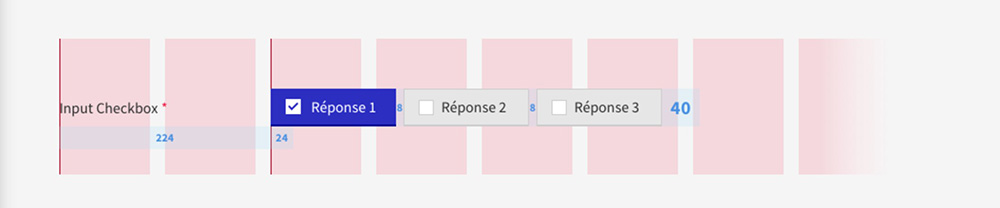
a) Position
- La checkbox est toujours à gauche de son label.
- La checkbox est espacée de 16 px de son label.
b) Alignement
La checkbox et son label sont ferrés à gauche de leur bloc parent.
c) Contenu
Le texte dans la checkbox doit succintement présenter la réponse.
d) Rédaction
- Le contenu du label accompagnant la checkbox doit être le plus clair et concis que possible.
- Afin de présenter le contexte de la liste de checkboxes, une phrase d’introduction peut être utilisée. Elle devra être traitée comme un [paragraphe].
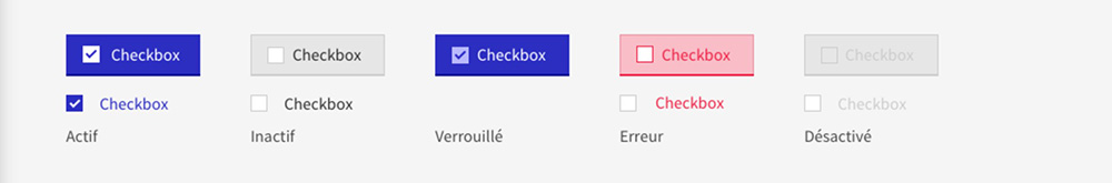
g) États
- Inactif
- Actif
- Verrouillé
- Erreur
- Désactivé
Style
Un style a été défini pour chaque composant, il possible d'importer uniquement le style du composant sur le projet fin optimiser le bundle.
On liste également les codes couleur utilisés, cliquez-ici pour voir l'ensemble des couleurs du Design System
Imports SASS
@import '@axa-fr/react-toolkit-core/src/common/scss/core.scss';
@import '@axa-fr/react-toolkit-form-input-checkbox/dist/checkbox.scss';
Typography
Component text should be set in sentence case, with only the first word in a phrase and any proper nouns capitalized.
| Class | Font-size (px/rem) | Font-weight | Font-family |
|---|---|---|---|
| .af-form-checkbox | 16 / 1 | 400 | Source Sans Pro Regular |